Alex wrote:Thing is, the "corrected" shot from The Other Guys also looks like shit. It looks precisely like the Raimi Spiderman movies.
I think the ideal is some place in between the two, but also, yeah, maybe not so much emphasis on the teal. The Dark Knight and The Matrix pulled off that look, but anything with Will Ferrell just shouldn't even go there.
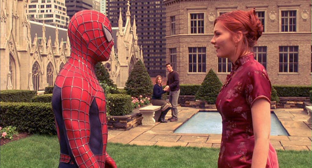
To be honest I don't remember the 1st Spiderman to look bad. I think a few sequences were a bit too red-yellow looking which I think is your complaint (the Green Goblin parade attack being the biggest one, where this still comes from: http://www.rellimzone.com/images/movies … e-06.png), plus the lighting was a bit uninteresting in some sequences.
I'm looking at a bluray copy now and to me the biggest problem I have is that it looks pan&scan due to, in my opinion, slightly too tight framing in most scenes, even though 1.85 was the intended frame from what I've read. I'm skipping around and so much seems to be medium or close-up shots, but claustrophobically tight a lot of the time.
Spiderman 2 has much of the same color palette, only it's widescreen since they wanted to fit Doc Oc and spiderman into the same frame.
Color to me looks fine, neutral, no real tints in either way mostly. Anything in particular that bothers you with the look of the Spidey movies?
I think I read the Dark Knight was finished without a Digital Intermediate, so while they likely did global timing/optical color corrections of scenes in the print, they didn't actually do split toning or any other color changes. At most they likely simply made a blue hour shot slightly less blue or green, basic adjustments to make daylight scenes look neutral and not slightly warm or cold, etc.
I think you and I are the same there, those types of changes never really bother me. It's like looking at a scene through a colored glass. However pushing colors around only in certain areas of the spectrum is where it tends to become more problematic, since you end up with completely normal skintones in the midrange, but then a green tint in shadow areas, which looks very unnatural.
Taking "Heat" as an example, I believe they used Tungsten balanced stock in daylight with no correcting filter, giving the daylight scenes a cold tone. They didn't unnaturally saturate orange skintones back into the image, so it has a very uniform, "natural" looking tint:
http://i.imgur.com/WBY4ZEh.png
However I do remember the 1st Matrix not bothering me, but the 2nd and 3rd ones for some reason I don't like the look of. I think the coloring is pretty much identical between all 3, but the film stock used for the first gives it a grit that the 2nd and 3rd don't have, and that makes the green cast not work as well to my eyes due to the clarity of the 2nd and 3rd. Maybe that's just me though. 


 Hope you're doing well Teague.


,)