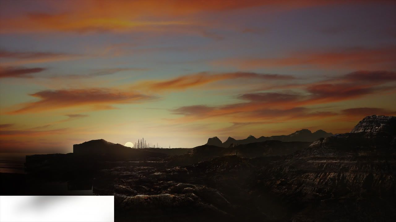
Yeah, but whatever. This looks pretty cool, dude. I like the restraint of the camera moves and shot selection, nice stuff that.
In terms of shooting FX plates, the most important thing is contrast between the element and the background, whether you do it on a black screen (probably best) or blue, or green, you're most likely not going to be screening the element on, you're going to use the element to make a black and white luma matte that will control a dust-colored solid in After Effects. That way you're not adding light to the scene, just integrating your dust into the existing world. (And that it's all the exact same color probably won't be noticed by anyone, because it moving realistically is much more important than the color. That said, sometimes doing this twice on top of itself with sliiiiightly different colored solids makes it look better.) Dorkman would know a lot about shooting, they did a fuck-ton of plate photography for RVD2. My advice above is for dust, not sparks (which would probably be screened), but whatevs.
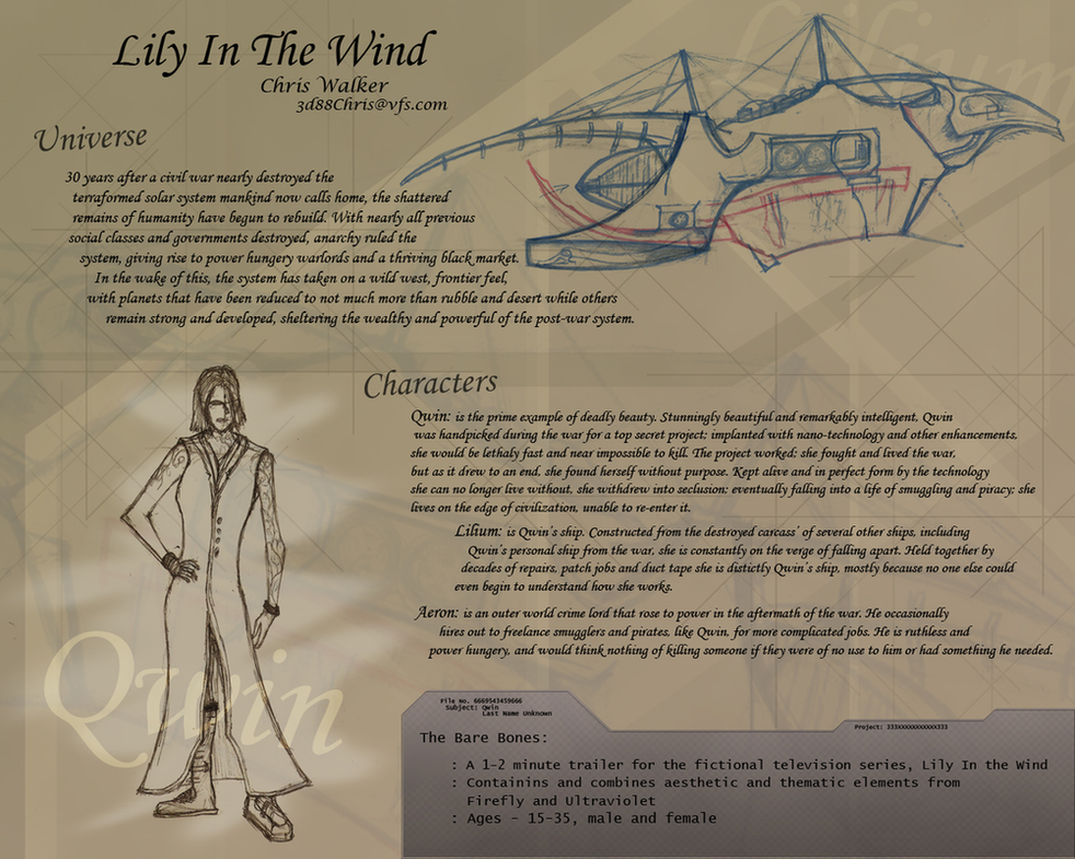
Ship exhaust is a whole fucking other thing, and I've learned that I get the best results when I don't try to leave an exhaust trail like the reaver ship in Serenity, but to leave a displacementy sort of effect that might also lower the contrast of the footage behind it. Not a big black putrid trail of smoke, but, it's leaving sort of a vapor trail that dissipates shortly after being born. The way I usually do this is make a single pass that's just a series of white particles coming out of the tail end of the ship, that fade to black over the course of a second or two, and use that pass as a luma matte for an adjustment layer that's just doing a turbulent displace. (Animate the "center" or "offset" of the turbulent displace in the direction opposite the ship's motion. If it just sits still, it looks wonky.)
In terms of making it look real, I get good results from my philosophy here but most people think I sound nuts: modeling is about one sixtieth as important as texturing. All that matters is the pixels on the screen reading as real, and that's entirely texturing. (...um, and ambient occlusion.) In your model, make sure you've got everything there, and maybe even some nice greebles and nurnies in the details so the object looks good on your reel. But in texturing, go fucking nuts. Every edge on the ship should be UV'd such that there's spotty, dinged-up dots on it that break up the line. As much as you can get away with it, texture in rivets or connective details that join two different materials. (And your materials also have to look badass. If your ship is filthy, it's easier to sell. A clean material is harder to nail than a dirty one.) (Partially because on a dirty one, you can use real-world images in your texturing and trick people into thinking it's a real-world object.)
In terms of lighting, HDR is your friend - for fill. (That "for fill" bit is something I never hear from people, but should always be attached to the advice.) What I mean is, render a whole pass with every light turned off but a giant, 100% luminosity orb around the scene that is textured with a mirror-ball image of your set. Turn on radiosity, hit render, and go off and read War and Peace while it cooks. The resulting pass should theoretically be perfect, but it won't be. Run an ambient occlusion pass, that plus your HDR will get you a long way.
The rest of the render passes are for you to discuss with yourself as the compositor. You're going to want a key light pass regardless, match the sun, get one of those, screen (or add, depending on your color correction style) that shit on top. The rest is for the compositor. If the reflective surfaces aren't working, make a pass that's nothing but the reflective bits, and give them something over-the-top to reflect. (You'll see a lot of FX artists' families in the windows of scifi ships. Any image with a lot of detail looks better in a reflection than your stereotypical chrome gradient. You won't recognize it, because the surface is bendy, it just needs something to say "reflection.") Additionally, sometimes it's helpful to render a...
...well, what I call a "retarded" pass. I never said I was a nice person.
A retarded pass is one where the ship is re-surfaced so that it's all 100% luminosity, 0% diffuse, and in bright ass fucking colors. All of the railings on your ship are pink, all of the basic walls are green, all of the windows are purple, all of the...etc.. This is so in AE, if the windows just don't fucking work, you can subtract away from the retarded pass so you have a perfect matte of just the windows (IE, lose everything but purple, then make the purple white) and use that as a luma matte to control an adjustment layer. Then you can tweak the windows individually, either on the footage below your color correction, or on top of the comp affecting all of your layers of bullshit below. It gives you comp-wide freedom for every "section" of the ship, and you'll probably get giddy with all of the options that pass gives you. (I did a few 3D graphics for Ryan's Sabershop site, this is one of the "retarded" passes I gave him. He used it, in this case, to run a "find edges" effect on and gave him the resulting badass outline look you see on said site.)
In terms of making it work in comp...beh. The tried-and-true answer is to add shit on top of everything - not just noise or camera shake, but subtle dust on top of the whole frame, lens flares coming in from the side of the frame, etc.. As far as I'm concerned, if a comp fails on black levels or edge fidelity, it fails all the way. The first things I check for are that the darkest point on your effect is no darker than the darkest spot in the plate. Additionally, edges shouldn't crawl and shouldn't be too fuzzy or too crisp.
And, yeah, shaking the whole comp after it's done doesn't hurt. *looks embarrassed*
One last thing: if your ship is three hundred feet away, finish the comp on it, and then bring in another pass that contains the full alpha outline of the ship. Make that pass a solid color (generate-> fill, in AE) and make that color the same color as the sky. Then lower the opacity on that pass to between 15% and 40%, to taste. This sets the ship back in the universe a little bit and is a good trick to have for some shots where you just can't make yourself happy with the comp.
Teague Chrystie
I have a tendency to fix your typos.


 Everyone keeps telling me that, but me? I just don't see it, nope just don't see it all. I have no idea where you guys are coming from.
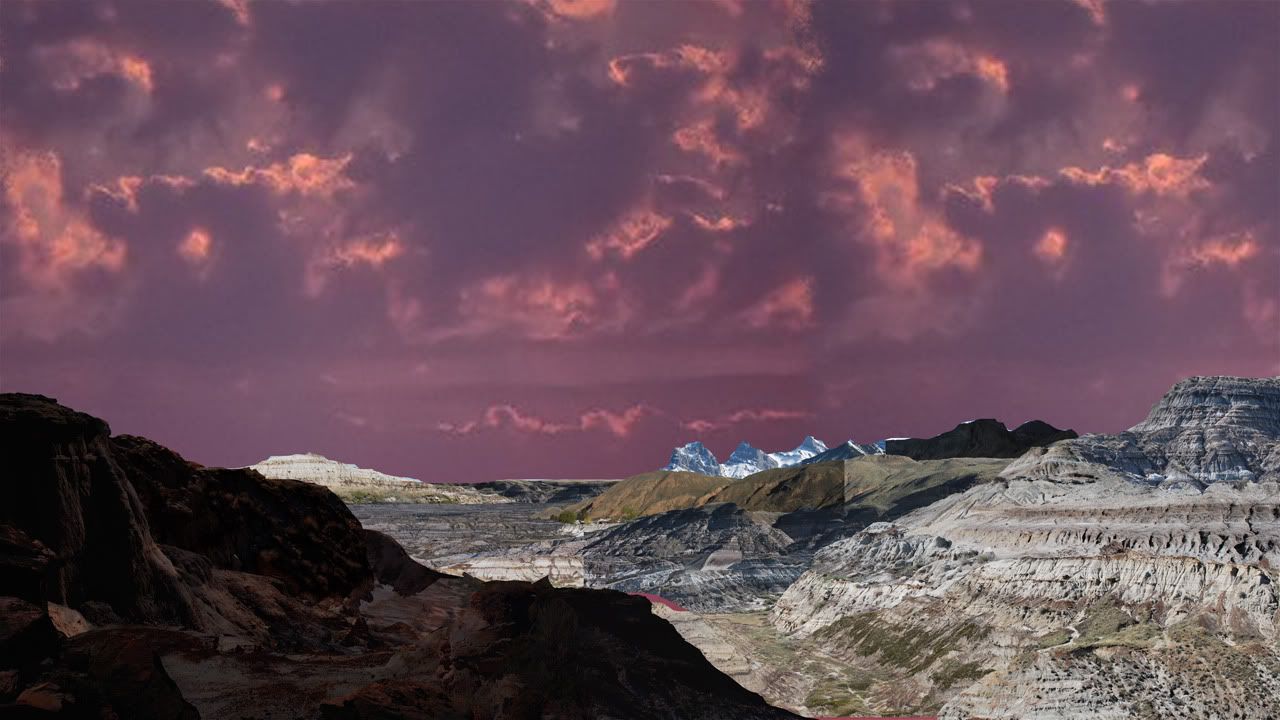
